Posted on December 19 2017
Often easy to incorporate into a pre-existing space, neutral colors are among the most popular because of its versatility and flexibility. This group includes wallpapers in various shades of beige, grey, taupe, white, and black. However, neutral colored wallpaper can be just as nuanced as other colors. While not as bold as red wallpaper or vibrant as purple or yellow wallpaper, each neutral wallpaper still has different color undertones. For instance, a particular wallpaper in light grey may feature a blue undertone that gives it a cool look, whereas a light grey with brown undertones will give it a warmer look. In this article, we list our top 7 wallpapers in neutral colors.
Faux effect wallpapers are a treasure trove for designers searching for neutral colored patterns. The majority of concrete wallpapers are featured in shades of gray; brick patterns are traditionally red but can be available in white, grey, and black as well; and wood wallpaper tends to be brown or beige. For our first pick, we’re going with Weathered Herringbone, a wonderfully designed wood wallpaper in various shades of beige. The photorealistic nature of this pattern really adds to the authenticity of the pattern while the unique zig-zag design gives it an interesting, dynamic look.
Van Gogh 17145 - Almond Blossom
Floral wallpapers have always added a touch of nature to the space and this one, inspired by Vincent Van Gogh, is no exception. Featuring a hand painted look, the “brush strokes” are vivid and inspire a new generation of artists and designers alike. Almond Blossom is available in several vibrant colors from burnt orange to a bright blue. However, this black and white one really grabs our attention because in the absence of color, the design comes to the forefront. The lines, floral imagery, and composition of the image is truly breathtaking. The deepness of the black background enhances the white flowers, creating a juxtaposition that’s perfect for any trendy space.
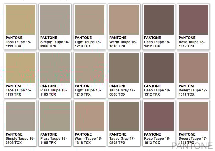
Taupe is often a color with a lot of subjectivity but this mainly stems from the undertones that heavily influences the final representation of that color. Just look at the different Pantone variations for “taupe” above!
Luxury Linen 089270 - Striped Linen
Going to a grey wallpaper with a cooler undertone, Striped Linen is a wallpaper the features natural fibers to create a highly textured, textile look. Striped wallpapers are perfect for odd-shaped spaces or overly large or small rooms, since the direction of the stripes can influence how visitors perceive the space. With vertical stripes making a wall seem taller and horizontal stripes making a wall look wider, playing with this illusion can be exactly what a designer needs to do in their next project.
Modern Motifs 218004 - Industrial Concrete
For our third pick, we’re going back to faux finish wallpapers with Industrial Concrete, which features a very abstract portrayal of concrete materials. While most of us are familiar with traditional concrete imagery such as this, the one above has an almost cloudy texture that utilizes more randomness than structured concrete. However, the abstract flair of this concrete wallpaper is exactly why it deserves to be on our list. It’s a bold move in a new direction, mixing different aesthetics together. In terms of the color, the taupe has a strong purple undertone, especially in the patches where the color is darker.
Splendour SD3533 - Vintage Bookshelf
If a neutral is your main color choice, don’t feel as if you have to limit your to a wallpaper design that’s completely white or grey or beige – it just has to be the predominant color on display. This beige wallpaper includes hints of grey-blue, off-white, and taupe, all of which keep with the neutral color theming, but beige is the main color at work. In terms of the imagery, it’s much different than a lot of other styles we’ve seen. While it may be difficult to place in a definitive category for style, the mood or theme of the wallpaper is much easier to classify. It has a traditional or classic touch, thanks to its color scheme and the “aged” effects on the book. The rustic, “old school” appeal of this pattern puts it firmly on our list of top neutral colored wallpapers.
Rivièra Maison 18373 - Anvers Linen Button
White wallpaper is no longer viewed as the “boring” choice anymore. Instead, it’s an understated, minimalist design choice that helps to pull the décor of a room together. When viewing white wallpaper, occupants of the room generally see the pattern before the see the color or shade of the walls. Thus, choosing an interesting or eye-catching design can set the tone. With this one, the button and fabric pattern on this vinyl wallpaper creates a unique sense of depth, especially given the slight depression of the buttons compared to the rest of the pattern.
Homesense 54610 - Contrast Damask
Black and white wallpapers often experiment with the strong visual contrast in order to create an interesting, attention-grabbing dynamic. The best designs will do this in a way that surprises us and often in ways we didn’t think of before. For our 7th and final pick, we’re going with Contrast Damask, an aptly named damask wallpaper that is truly a modern take on the traditional wallpaper category. Damask wallpaper is often noted for its intricate details, but this design distils it to its core components: the sweeping, intersecting curves that hint at floral imagery. Both sections of the wallpaper – the bold black damask motif and the white area that surrounds it – work in tandem to create a contemporary, trendy look.


0 comments