Posted on January 31 2018
Maps and location-based designs add a unique flair to the space. Whether it’s a wallpaper for a dining room or a digital mural for a lobby, geography-themed prints never fail to draw people’s attention with its interesting, unorthodox look. While some designs focus on an exact replication of world maps, others may use a more creative, out-of-the-box aesthetic. In this article, let’s take a look at some stylish geography-themed digital murals and wallpapers that would be excellent additions to any room.
Minimalist Topography (2001048 / Mural)
Starting off with one of our newest digital murals, Minimalist Topography is an abstract take on geographic prints. The thin lines present a feeling of lightness, giving the space a more relaxed, open aesthetic. Additionally, the minimalist color palette – featuring black and beige colors – imbues the room with a contemporary look. With neutral colors, this digital print can easily slide into pre-existing spaces and be incorporated into the current color scheme of the room. With an abstract appearance, this digital mural is perfect for design projects where creating a high-end, artistic look is the main goal.
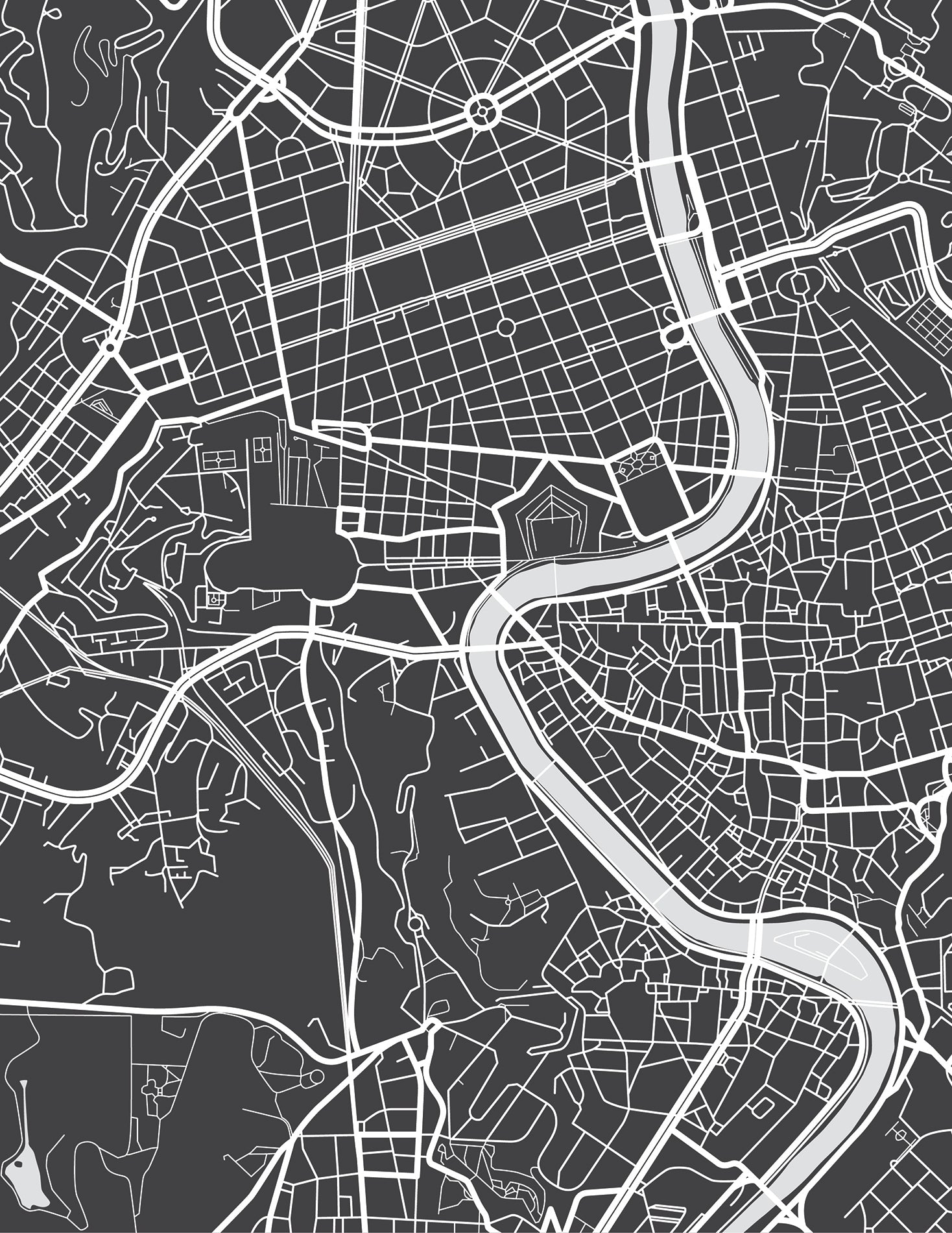
Sticking with contemporary takes on geography-themed digital murals, another one of our newest prints features a top-down view of Rome. Again, this uses a neutral color scheme – black and white – creating an iconic, recognizable image. Unlike the previous example that featured the curving lines of a natural landscape, this one emphasizes the straight lines of a man-made urban environment. The geometric look is bold, even with a minimalist color palette.
Moving from the contemporary Minimalist Topography to one that’s very much rooted in history and tradition, this digital mural showcases an Asian-themed world map that features an aged, weathered aesthetic. One of the major benefits of using digital murals is the high-quality, clear imagery that results from the printing process. The photorealistic look is on full display here, with crisp text and borders that create an authentic look. The bold colors – orange, blue, and yellow – stand out from the beige background and black grid lines, creating an interesting, eye-catching image that’s vibrant and noticeable.
With the previous two examples being digital prints, let’s take a look at wallpapers. Sticking with the classic beige color palette, World Explorer combines a top-down view of a map with photographs of iconic landmarks around the world. The use of two different viewpoints not only creates an interesting contrast, but a lot of visual variety for this wallpaper. Using this wallpaper as a featured wall? Consider pairing it with Traveller, another product from the Splendour collection. The Traveller wallpaper features just the background portion (i.e. the top-down map), allowing you to create a unified look throughout the space.
Vera Totivs Expenditionis - World Maps MAP758007
Switching the map styles up a little bit, we’ve gone from a top-down, topographic view to a traditional world map. Next, this digital mural features an interesting cross-section of the globe, adding a geometric style with its circular shapes. This print is bursting with detail, whether it’s the small portraits of ships or the intricately designed border around the map itself. Each area of the digital mural is filled with imagery featuring deep colors that add to the stylized look.
Similar to the previous digital mural, this one features softer colors and a more minimalist look. It trades in thick, intricate borders for a pattern that’s more streamlined and simplistic, namely the text that fills up the empty spaces in between the globe and circular shapes. This creates a unique, handcrafted composition. If the different colors aren’t to your liking, keep in mind that digital murals can always be edited, and this includes the color scheme as well.
General Map of The World - World Maps MAP758014
Last but not least, let’s end our list with a traditional map that would be an excellent choice for either residential or commercial settings. Featured with a grey color scheme, the map is encased in a thick border with a cloudy texture. When used as a feature wall, the border allows for a more seamless match with whatever secondary wallpaper you’re using, such as plain textured wallpaper. The large border also works to emphasize the map, putting more focus on the central area of the digital mural.

 Minimalist Topography (2001048 / Mural)


0 comments